The shock of the new
Random thoughts on the impermanence of modernism.
|
The design of organisations and products

|
The curse of novelty
What is new cannot last as the new. Either it dies, or it grows old. So if your only quality is novelty, you will die young. Conclusion: build with qualities other than novelty. If only novelty gets you out of the gate — enjoy your fifteen minutes. Blondie had it backwards: Stay pretty? Die young.
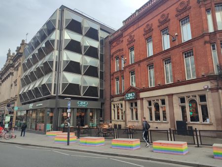
Clean lines and flat panels don’t age well. They don’t take dirt. It is easy to make them look tired & decrepit. Classical structures — as in “traditional”, but also in the strict sense of classical —do age well. Ornament and figure instead of functional cleanliness is punctuation; it anticipates decay. Ergo, ornament has a function: exactly that: to anticipate decay. Dirt and grime colours it in; highlights lines, enhances it: gives it an air of permanence. This is may be a variety of anti-fragility. If your sense of modern is so clean and functional that it is rendered vulnerable by atrophy, rather than simply stoic, and dignified, steer clear of it. Modernism suffers from decay that obscures and debilitates its form — here decay is noise: classicism benefits from decay that accentuates its form — here decay is signal. ===Innovation and plausibility=== Legaltech plausibility heuristic — ask: why hasn’t it been done before now?
Good answers: “The technology did not exist before now.” “The regulation did not allow it till now.”
Bad answers: “The market is not yet ready for it.” “Customers lack the necessary vision.”[1]
Most nascent legaltech has only bad answers. (“AI”, machine learning, neural networks ≠ “tech that didn't exist till now”.)
See also
References
- ↑ This is another way of framing the observation: “we do not understand what our customer wants”.