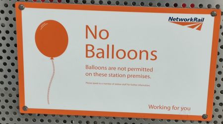
No balloons
The JC doesn’t like the sorts of signs that warn you, or forbid you, or tell you what you can or cannot do. They emanate from the same passive aggressive instinct as the email sent from an unmonitored account — they’re a cheap shot at someone who can’t hit back — and more to the point they are a failure in design: if you don’t people to walk on your grass, stick up a fence, or pave the damn thing, or create some obstacle — do with code what you are trying to do with bossiness.

|
So some thoughts about signs.
Where signs are okay: in some cases we won't mind signs. They’re part of the design: they impart vital information and there's no better way of transmitting it.
- Guides: Signs that help you figure out what you want, and it can’t otherwise be made obvious through design and affordance. Maps, menus and street signs, for example. There's only one way of being sure I’m on Oxford Street, and that’s sign saying it. Likewise it is good to know that this is the turn-iff for Stansted: the M11 is a long motorway and it has lots of exits, and there's no easier way of intuitively knowing. And a menu: well how am I supposed to know what's on your menu without, well, a menu? But here be brief, clear — monosyllabic.