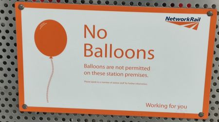
No balloons
It is pleasing to imagine the sequence of events that led to the erection, of Liverpool Lime Street station, of the following sign:

|
NO BALLOONS.
Balloons are not permitted on these station premises.
Please speak to a member of station staff for further information.
- Network Rail: Working for you.
Now there are many things you can imagine the proprietor of a busy rail terminus might not like brought into the premises. Some it might feel strongly about: Snakes, for example. Crocodiles. Explosives. Undomesticated grazing livestock. But no mention is made of these. Then there are article which, while posing no immediate danger to life and limb, could be disruptive enough to the orderly functioning of the station. If these were frequently encountered, they might justify a mention. Megaphones. Boomerangs. Stink-bombs. Footballs, even. But there are no mention of these. Yet somehow the humble balloon — hardly the sort of thing to warrant even a mild aversion, surely — has earned its own special category of turpitude. What can have happened? Was the fat controller one day plagued by mendacious Liverpudlian urchins, popping their balloons in his ear, and decided to get his own back? Has it helped? In his limited experience, mendacious Liverpudlian urchins are not disposed to paying much attention to signs of this sort in any case. It only encourages them.
The JC doesn’t like the sorts of signs that warn you, or forbid you, or tell you what you can or cannot do. They emanate from the same passive aggressive instinct as the email sent from an unmonitored account — they’re a cheap shot at someone who can’t hit back — and more to the point they are a failure in design: if you don’t people to walk on your grass, stick up a fence, or pave the damn thing, or create some obstacle — do with life code what you are trying to do with bossiness.
So some thoughts about notices, which we will arbitrarily define as written directions to do, or refrain from doing, something.
If in doubt, use design principles to avoid signs
Most signs — other than the exception of directions, and signposts, don’t work very well. They suggest you have failed in your task of designing your space. The language of design: affordances, signifiers, mapping and feedback — Don Norman’s The Design of Everyday Things can tell you what you need to know about these — can help, but your goal should be psychological. If you have designed your space well, then — with the exception of signposts — you shouldn’t need signs
If you really can’t have people walking on your grass, build a fence. But if you are building a grassed area where people walk by, ask why. Use a hardier grass seed. But if you are just being an officious twerp because it is your property and you can, well — don’t.
Where signs are okay
in some cases we won't mind signs. They’re part of the design: they impart vital information and there's no better way of transmitting it. Signs that help you figure out what you want, and it can’t otherwise be made obvious through design and affordance. Maps, menus and street signs, for example. There's only one way of being sure I’m on Oxford Street, and that’s sign saying it. Likewise it is good to know that this is the turn-iff for Stansted: the M11 is a long motorway and it has lots of exits, and there's no easier way of intuitively knowing. And a menu: well how am I supposed to know what's on your menu without, well, a menu? But here be brief, clear — monosyllabic.
Likewise, where a condition is temporary enough that a redesign of the space is not practicable: So: “closed for maintenance”, or “thank-you for wearing a mask and maintaining social distancing”.